
Welcome Spring with Fresh Color & Timeless Style:
As the days grow longer and nature awakens, it’s the perfect moment to refresh your home with a spring-inspired palette for 2026. At Heritage Design Interiors, we believe that thoughtful color choices have the power to breathe new energy into your space—whether you’re planning a full redesign or just a subtle update.
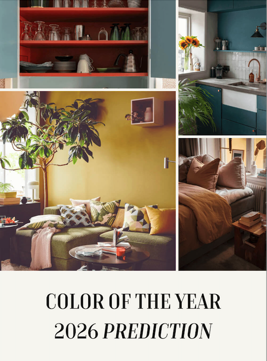
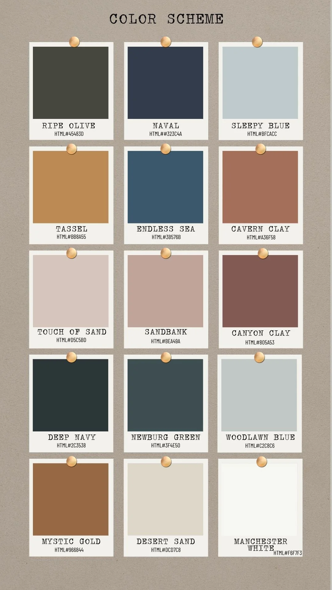
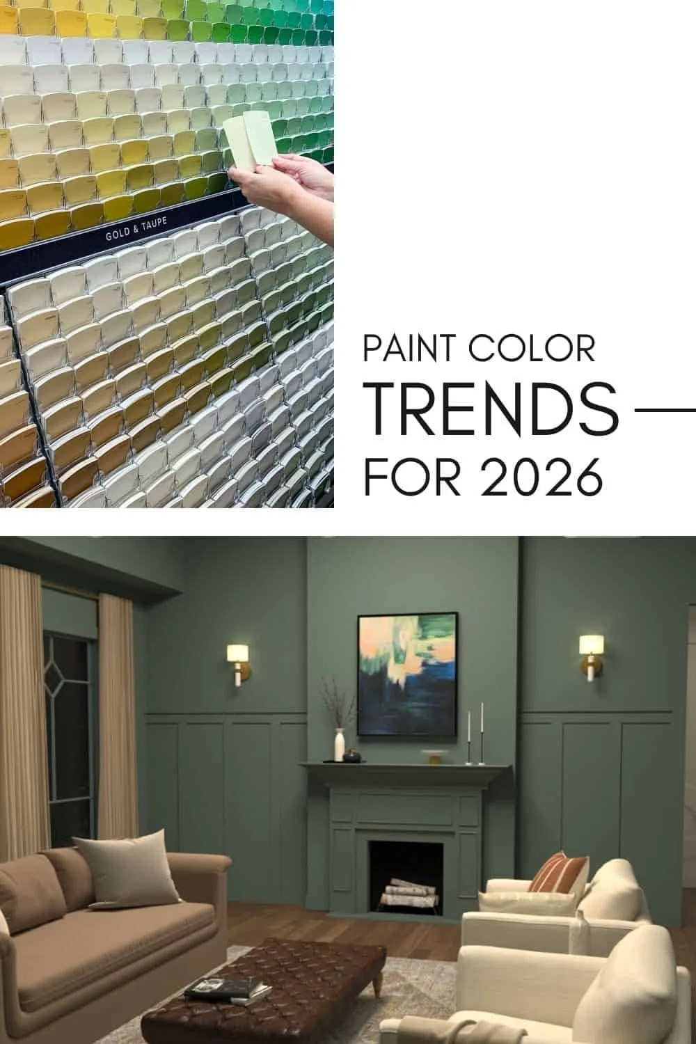
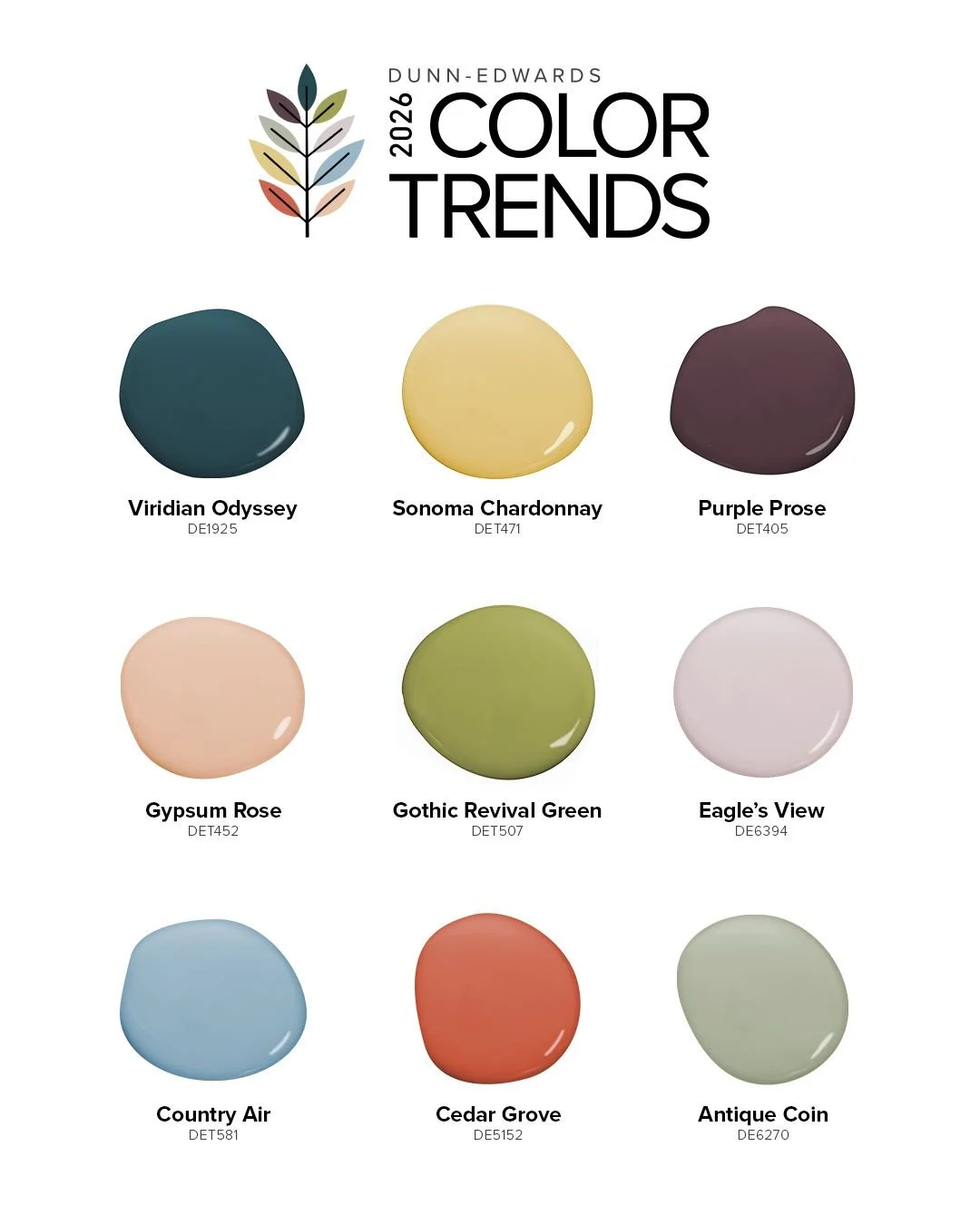
🎨 What’s Trending: New Colors for 2026
Interior design is shifting toward colors that feel both grounded and expressive. Here are the standout shades poised to define interiors this year:
🌿 Tranquil Teals & Blue-Green Hues
Teal and smoky jade tones are gaining traction as rich yet calming foundations for living rooms, bedrooms, and bathrooms. These hues bring depth without overwhelming a space and work beautifully with natural wood and texture-rich décor.
🌞 Warm Yellows & Earthy Ochres
Sun-kissed warm yellows and classic ochre tones are emerging as joyful alternatives to neutral whites. They evoke optimism and pair effortlessly with deeper accent tones in textiles and accessories.
🌳 Organic Greens & Mossy Accents
Rich, nature-inspired greens—think moss and olive—offer serenity and a direct connection to the outdoors, perfect for spring. These tones pair exceptionally well with wood finishes and stone elements for a cohesive, organic aesthetic.
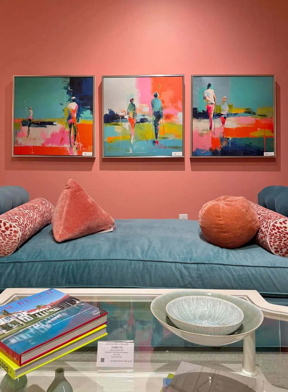
⚜️ Dusty Jewel Tones & Muted Reds
Sophisticated, softened jewel tones like muted garnet and rich berry can act as bold accent walls, upholstery, or statement furniture pieces, adding warmth and character to your design.
☁️ Cloud Dancer & Warm Neutrals
For those who prefer a serene backdrop, warm off-whites like Pantone’s Cloud Dancer and soft khaki neutrals offer timeless elegance and flexibility across design styles.
🏡 Spring Refresh: How to Use These Colors
1. Accent Walls for Impact
A single painted wall in teal, moss green, or ochre can instantly redefine a room without overwhelming it. Try this in your living room, bedroom, or home office.
2. Layer with Textiles
Integrate trending colors through throw pillows, rugs, artwork, and curtains. Window treatments in complementary shades can beautifully anchor your palette while adding depth and softness.
3. Harmonize with Natural Materials
Pair these hues with wood, stone, and woven elements to achieve a curated, heritage feel—one that balances tradition with a fresh, spring-forward vibe.
4. Start Small, Think Big
Not ready for full-room color? Introduce trendy shades in curated décor pieces or seasonal accessories for an easy and cost-effective update.
🌟 Why Colors Matter
Color sets the emotional tone of a space—uplifting, calming, energizing, or cozy. Spring is your invitation to experiment, but remember: trends are tools, not rules. The best interiors reflect your personality, lifestyle, and how you want to feel in your home.
At Heritage Design Interiors, we’re here to help you translate the year’s most inspiring color trends into thoughtful design choices that feel personal and timeless. Ready to start your spring update? Let’s make your space bloom. 🌼
Visit us at HeritageDesignInteriors.com or stop by our showroom to explore beautiful insulating shade options tailored to your style and needs.